
OK not really a party, but new yarn is reason to celebrate.
I wrote on Friday about some projects that have been inspiring me lately. I love doing that because it puts everything in one place for me when I’m shopping.
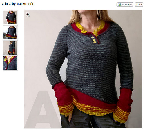
I knew I wanted to look for yarn for 3 in 1 and I found the perfect colors at Neighborhood Fiber Company.
I ruminated on colors for quite a bit on Friday night – thinking about what I like to wear (pink, red and purple) and where I have holes in my wardrobe (orange, yellow and maybe some greens). I knew I wanted to use some colors I don’t often use, but I also wanted to make a cohesive top when I was done. I was afraid I’d make a top the looked like I just layered on three tops. Oh and I’m not doing the stripes. The tonal variations in the Neighborhood Fiber Company is enough for me.
Enter the Color Wheel
There are tons of great articles on using a color wheel to select colors and I thought this one was quite good. It talks about different types of color combos – e.g. primary, analogous and complementary – and the real value for me – lots of pics of the color combos in action.
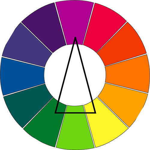
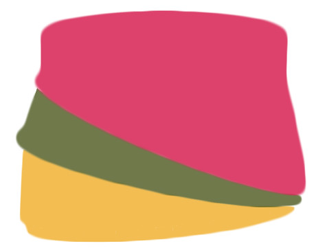
I of course started with one of my favorite colors to wear – a deep magenta pink – and added on a green and an orange-yellow. For the color geeks this is called Split Complementary.
I got Neighborhood Fiber Company Studio Sock in
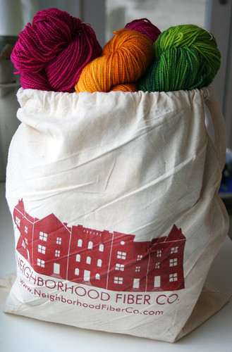
- Charles Village (magenta)
- Del Ray (orange-yellow)
- Anacostia (green)
And look at the cute bag Karida was giving out. A girl can never have too many bags.
I’m trying to decide which order to use for the green and yellow. I like both and keep changing my mind. What do you think? I’ll be wearing this with jeans so I don’t think that’ll have an effect.
Yellow in the middle
This feels like the less traditional way for me to place the colors – I like that! Sometimes I like the swath of yellow in the middle and sometimes I think I’ll look like I’m walking around with a yellow boomerang on my midsection.
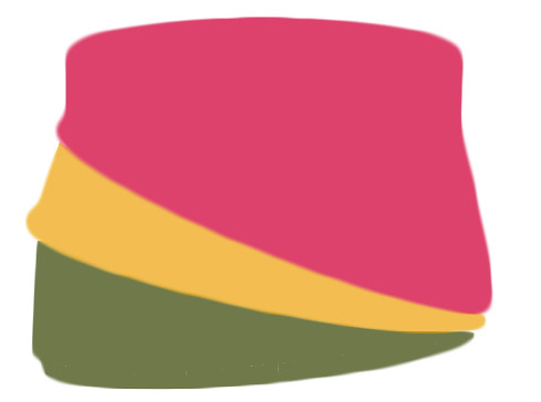 Green in the middle
I like the way the green and pink look next to each other. The progression of colors looks like it’s going from light to dark.
I can’t CO until I figure this out because it’s knit bottom up. Help a knitter out?
I’ll catch you on the purl side.
More from savannahchik.com


Glad you had fun! My instinct is for green to be in the middle. Another way to consider it, maybe, is which color do you like more? It looks like the bottom color gets more visibility than the middle one.
Good point. I go back and forth. Both shades have a lot of variability – which I love! It’s one of the advantages of picking out the skeins in person. I’m itching to CO so I have to decide soon…
Hmmm. I’m going the other way here. I think the darker color on the bottom (green) “ends” or defines the sweater better. I think I also may like the pop of a swath of solid yellow in the middle. (Are you striping the top and bottom?)
good point about “ending” the sweater. i’m not going to stripe it. the skeins i got are quite tonal so i think it will give a bit of interest without true striping. i don’t think i want to wear stripes.
I agree with you about not doing the stripes. I’ve used Neighborhood Fiber and it has great tonal variation. By the way, I forgot to say that either way, I love the colors you chose.
thanks! i’m leaning toward green on the bottom – i like your comment about “ending” the sweater and i like having the yellow/orange color closer to the top.
i’ve been swatching but need to go down a needle size. at this rate i’ll be casting on at midnight 😉
such a fun sweater and great colors! can’t wait to see what you decide~ i’ve used neighborhood sock yarn & loved it~
happy sunday!
katie
i’m enjoying swatching with it – the colors are incredible. dare i say even more scrumptious than Madtosh?
Cute sweater. If you like the original the way it is, the lighter color is on the bottom and looks like a shirt peeking out. That would be my vote. PS, I’ve been following you since I knit your Natalya gauntlets for my niece and daughter years ago.
interesting – i hadn’t thought of it that way. i think it’s more about the layered look in general. i’m leaning toward green on the bottom. at least, at 5:25 pm i am 😉
I’d put the darkest colour where I’m heaviest then do colour placement of the other two around that.
E.g. If I were top heavy, I’d put the green shade there, then maybe the pink then yellow at the bottom. If I had a bit of a stomach, I’d put the pink at the bust area, yellow in the middle, then green at the bottom.
Can’t wait to see what you decide to do.
Well, the pink is definitely the top color – it uses 4 times as much yarn so I had to make that decision when buying the yarn.
I’m pretty hourglass so with your approach I might say the orange.
I’d approach this from a different point of view:
Which colour looks best next to your skin at the neckline?
Great question! Pink is definitely the best and that’s why I chose pink to be at the top It uses a lot more yarn than the other colors so I needed to make that decision before buying.
I’m leaning toward orange in the middle!
I’m Karida’s social media consultant, and we’re so happy that you enjoyed her yarn and her booth. Great colors and pattern choice! Would it be okay if we shared this on the NFC Facebook page? Might inspire others :). Thanks!
of course! karida deserves all the attention she can get!
Awesome! Thanks!
Looking forward to seeing how this patterns turns out in the colors you chose. So pretty!
I actually like the pop of yellow in the middle. It doesn’t overpower and adds interest. The green on the bottom seems to finish it best.
me too! and good thing since i’m done with the green already – ha!
Sounds like you already decided! I sure love the magenta.